
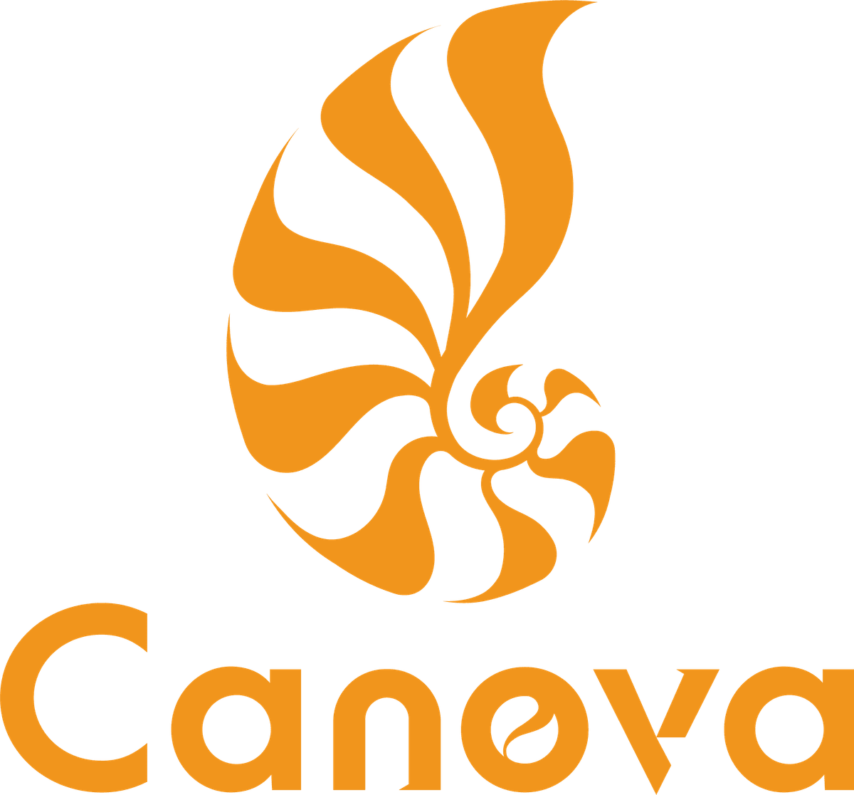
The new Canova logo marks a new chapter in global trade and innovation
• Brand Motto
“Power from the Ocean, Precision for Trade”
This new visual identity represents not just a logo change, but a reaffirmation of Canova’s mission—to empower industries with precision technology while navigating global trade with reliability and trust.
• Nautilus Shape
The Nautilus is a symbol of the golden ratio in the ocean, symbolizing Canova's professional layout and stable growth in the global ocean trade, and echoing the company's expansion and sustainable operation in the international market. It also called for ocean trade to be an important force in promoting Taiwan's development.
• Kinetic Vortex
The lines in the logo simulate the streamlined feeling of the motor blades and turbine rotation, reflecting Canova's technical focus and innovative spirit in the field of motors and power transmission.
• Color Expression
Orange represents vitality, kinetic energy and innovation, and also conveys a brand attitude of warmth, trust and positive expansion.
• Standard Font Design
The "o" and "v" in the word "Canova" are specially integrated into the visual vocabulary of blades and power cycles, echoing the perfect combination of nature and technology.
Nautilus Shell — Ocean & Trade
• Symbol of natural geometry and the golden ratio
• Represents ocean trade and global expansion
• Symbolizes steady growth and sustainabilit
Dynamic Spiral — Motor & Power
• Spiral lines inspired by motor blades
• Showcase expertise in power technology
• Convey innovation and kinetic energy
Brand Color
• (Energy Orange)Vitality, energy, innovation, trust
Typography Highlight
• "o" and "v" are integrated into the image of power blades
• The perfect combination of nature and technology
• Strengthen brand recognition